Code
random_normal <- rnorm(n = 1, mean = 0, sd = 1)Example RNA-seq Analysis
This document outlines the steps to perform a differential expression analysis at the gene-level, with explanations of code, methods and best practices throughout. You may notice that this file has the .qmd extension, specifying it as a Quarto document. This can be considered the “next generation” of R Markdown. At it’s core, Quarto works the same way as R Markdown. However, Quarto provides some additional functionality that can be useful. Code chunks and text from existing R Markdown documents can be transferred to Quarto documents and should simply just work.
Quarto/R Markdown provides an authoring framework for data science. In a single document, the user can incorporate both code and paragraphs of text. When generating the report, the code gets executed and its output is displayed in the report. This enables analyses that can easily be turned into high quality reports to share with an audience. Importantly, this facilitates reproducibility, and frequent rendering of the report is encouraged to ensure code runs from top to bottom. It is even possible to insert inline code, allowing the values of variables to be reported within a paragraph of text. For example, let’s use a code chunk to generate a random number sampled from a normal distribution with mean of 0 and standard deviation of 1, and assign it to the variable random_normal:
random_normal <- rnorm(n = 1, mean = 0, sd = 1)We can now use this variable to report our result: The randomly sampled number was -0.708461. You will notice each time you generate the report from this document the number will change.
Code chunks require a header, which is displayed in its most simple form as {r}. I have assigned a label to the above code chunk, which is best practice but also optional. Naming code chunks is handy for debugging, and incredibly useful when the code outputs a plot. Quarto generates the plot as a png file with a filename corresponding to the chunk label, and saves it in a convenient location. This saves the hassle of writing further code to save a figure, and it can easily be shared with colleagues, used for a presentation, etc. Chunk headers won’t be visible in the final report, but instead control how that particular code chunk acts.
There is plenty more you can do with Quarto and R Markdown. Follow these links to the Quarto and R Markdown documentation.
RStudio is your friend, providing easy access to help pages for R package functions, classes, data, etc. I know of two simple ways to access help pages. The first is to click anywhere within the function and hit the F1 key. The second is to use the console to type the function name after a question mark, e.g. ?rnorm. Either of these should automatically focus the help tab found in the same panel as the RStudio file explorer.
There is huge amount of information online, particularly for RNA-seq analysis as it is quite mature now. Websites such as Stack Exchange, Stack Overflow, and the Bioconductor and Biostars forums are great resources where almost every question has already been asked.
When implementing code that I have not written myself, I find it super useful to step through code line by line, to see how each individual function modified the preceding object. While a common convention in R programming is to chain functions together with the magrittr (%>%) or more modern base pipe (|>) operators, you don’t have to run this all at once. Simply highlight the desired portion and hit Ctrl + Enter (or probably Command + Enter on Mac), assess the output, and incrementally include the next function in the chain to see how the object is modified.
Bioconductor is an open source project that provides tools and software packages for the analysis and interpretation of high-throughput genomic data. If Bioconductor is not already installed on your system, or is an older version, follow the installation instructions on the Bioconductor website. At the time of updating this document, Bioconductor was in version 3.21 of the release cycle, which can be installed as follows:
if (!require("BiocManager", quietly = TRUE))
    install.packages("BiocManager")
BiocManager::install(version = "3.21")
If Bioconductor was successfully installed, you will have access to the BiocManager package. Using BiocManager is the recommended way to install any further packages.
In the above code chunk I have added a chunk option to its header (eval=FALSE). This specifies that that code chunk will not be executed when a report is generated.
The first step in any analysis is to load packages into the environment, allowing easy access to functions required for the analysis. Attempting to load a package will error if the package is not already installed on your system. For any packages that require installation, we can use the RStudio console to do so, e.g. BiocManager::install("tidyverse"). You can install all the required packages for this document with the following code:
BiocManager::install(c(
    "tidyverse", "magrittr", "here", "kableExtra", "RColorBrewer", "ggpubr",
    "scales", "AnnotationHub", "ggrepel", "ggtext", "glue", "pander",
    "reactable", "htmltools", "edgeR", "limma", "tximport", "pheatmap"
))## Common packages
library(tidyverse)
library(magrittr)
library(here)
library(kableExtra)
library(RColorBrewer)
library(ggpubr)
library(scales)
library(AnnotationHub)
library(ggrepel)
library(ggtext)
library(glue)
library(pander)
library(reactable)
library(htmltools)
## Document-specific packages
library(edgeR)
library(limma)
library(tximport)
library(pheatmap)Now we set up any further options as desired for the document.
## Set the ggplot2 theme
theme_set(theme_bw())
## Allow markdown formatting of title and axis labels with the ggtext package
theme_update(
    title = element_markdown(),
    axis.title = element_markdown(),
    legend.title = element_markdown()
)Specify variables that we use to grab reference annotations with the AnnotationHub package. The Ensembl version specified here should match the version used for reference files during pre-processing.
ens_species <- "Homo sapiens"
ens_release <- "112"
ens_assembly <- "GRCh38"
primary_chrs <- c(as.character(1:22), "X", "Y", "MT")ah <- AnnotationHub() %>%
subset(species == ens_species) %>%
subset(rdataclass == "EnsDb")
ahId <- ah$ah_id[str_detect(ah$title, ens_release)]
ensDb <- ah[[ahId]]transcripts <- transcripts(ensDb, filter = AnnotationFilterList(
SeqNameFilter(primary_chrs), TxBiotypeFilter("LRG_gene", condition = "!=")
))
mcols(transcripts) <- mcols(transcripts)[
c("tx_id", "tx_id_version", "tx_is_canonical", "gene_id", "gc_content")
]genes <- genes(ensDb, filter = AnnotationFilterList(
SeqNameFilter(primary_chrs), GeneBiotypeFilter("LRG_gene", condition = "!=")
))
mcols(genes) <- mcols(genes)[
c("gene_id", "gene_name", "gene_id_version", "gene_biotype", "description")
]An EnsDb object was obtained for Ensembl release 112. This contains the information required to set up gene and transcript annotations.
tx2gene <- as_tibble(transcripts) %>%
dplyr::select(tx_id, gene_id)Load in our sample metadata. The metadata for this analysis is contained in the samples.tsv file that I generated for my Snakemake workflow. Importantly, this contains the information we require for defining groups that will be subject to statistical testing.
I almost always use the here() function of the here package to specify file paths. This enables easy file referencing relative to the top-level directory of a project, keeping everything self-contained, easily transferrable between systems, and version tracked with Git where appropriate. A common alternative is to use setwd() at the beginning of the document, but I find this to be far less stable.
meta <- read_tsv(
    here("smk-rnaseq-counts-1.2.7/config/samples.tsv")
) %>%
    mutate(
        group = fct_relevel(group, c("Control", "UPF1")),
        sex = factor(sex)
    )
meta %>%
    dplyr::select(sample, group, sex, tissue) %>%
    kable(caption = "Sample metadata") %>%
    kable_styling(
        bootstrap_options = c("striped", "hover", "condensed", "responsive")
)| sample | group | sex | tissue |
|---|---|---|---|
| S01_upf1 | UPF1 | M | Fibroblast |
| S02_upf1 | UPF1 | M | Fibroblast |
| S03_upf1 | UPF1 | F | Fibroblast |
| S04_control | Control | M | Fibroblast |
| S05_control | Control | M | Fibroblast |
| S06_control | Control | M | Fibroblast |
| S07_control | Control | F | Fibroblast |
| S08_control | Control | F | Fibroblast |
| S09_control | Control | F | Fibroblast |
This dataset contains six control and three patient Human Dermal Fibroblasts (HDF) cell line samples carrying missense variants in UPF1, which are speculated to affect UPF1’s RNA and/or ATP binding.
Patient data of similar missense variations has previously been assessed in LCLs. Differentially expressed genes (DEGs) from this previous analysis were shown to overlap and correlate with DEGs from LCLs in individuals with Fragile X Syndrome. The original purpose of analysing this dataset was to investigate if a similar trend was observed in Fibroblasts, but for this example let’s just treat it as a standard differential expression analysis.
Now that we have the metadata, let’s setup colour palettes that we will consistently use to represent various factors (i.e. group, sex) in our plots.
pal <- brewer.pal(8, "Set2")
pal_group <- pal[1:2] %>%
    set_names(levels(meta$group))
pal_sex <- pal[3:4] %>%
set_names(levels(meta$sex))Two common choices for generating counts from RNA-seq data are Salmon or featureCounts.
Salmon is a lightweight, alignment-free (or quasi-mapping) tool that directly quantifies transcript-level abundance from FASTQ files using a pre-built transcriptome index. It corrects for sequence- and bias-related factors like GC content and positional bias, and produces transcript-level estimates such as TPM, as well as estimated counts. Salmon is especially efficient and well-suited for workflows that require fast transcript-level resolution, or when downstream tools like tximport are used to aggregate transcript-level estimates into gene-level counts.
featureCounts is an alignment-based tool that quantifies reads by counting how many align to genomic features such as genes or exons. It relies on a pre-aligned BAM file, typically produced by aligners like STAR or HISAT2, and uses a reference annotation to assign reads to features. Because it operates at the gene- or exon-level on genome-aligned reads, featureCounts is widely used in traditional RNA-seq pipelines, particularly when accurate splice-aware alignment is important. It produces raw counts suitable for differential expression analysis with tools like edgeR and DESEq2.
Counts files can be large so I tend not to push these to GitHub, instead opting to transfer them manually from the Phoenix HPC to my local device. This means the count data is not tracked, but, the Snakemake code still is. Snakemake ensures reproducibility and can always be used to generate the same file from raw data. This is the approach I take for any large files; as long as we have access to the raw data, our code should be written such that it can consistently produce the same outputs. For the purpose of this example the count data is included in the repository.
Examples of importing count data from both Salmon and featureCounts is provided below, just click the appropriate tab! Note, however, we’ll use Salmon counts for the remainder of this document.
counts <- read_tsv(
    here("smk-rnaseq-counts-1.2.7/results/featureCounts/reverse/all.featureCounts"),
    comment = "#"
) %>%
    dplyr::select(-c(Chr, Start, End, Strand, Length)) %>%
    set_colnames(basename(colnames(.))) %>%
    set_colnames(str_remove(colnames(.), "\\.bam")) %>%
    as.data.frame() %>%
    column_to_rownames("Geneid")
## Subset for genes on primary chromosomes & samples in metadata
counts <- counts[
    rownames(counts) %in% genes$gene_id,
    colnames(counts) %in% meta$sample
]txi <- list.files(
here("smk-rnaseq-counts-1.2.7/results/salmon"),
pattern = "quant.sf", recursive = TRUE, full.names = TRUE
) %>%
set_names(basename(dirname(.))) %>%
tximport(
type = "salmon", tx2gene = tx2gene, ignoreTxVersion = TRUE,
countsFromAbundance = "lengthScaledTPM"
)
counts <- txi$counts
## Subset for genes on primary chromosomes & samples in metadata
counts <- counts[
rownames(counts) %in% genes$gene_id,
colnames(counts) %in% meta$sample
]The dot/period, ., is commonly used within a chunk of code chained together with magrittr pipe operator, %>%. When a pipe operator is used, the object preceding the pipe is always used as the first argument of the following function. There is also another type of pipe operator, the base pipe, |>. This is a newer implementation which acts almost identically and can be accessed without loading additional packages. The magrittr pipe, however, still has an advantage over the base pipe in that the preceding object can be specified as . for additional arguments in the same function, as seen in the above code.
From here onwards we set up our analysis to perform differential expression (DE) testing using the edgeR package. Another commonly used package for DE analysis is DESeq2. While the overall goal and methodology is conceptually similar between the two approaches, this is where some steps may diverge, particular in the use of R objects and functions. There is no correct choice between the two packages, they are both incredibly robust approaches that perform as such. The edgeR User’s Guide is filled with extensive information and use cases for the methodology implemented in the following sections.
You have probably heard Counts Per Million (CPM) and Transcripts Per Million (TPM) used to describe normalised expression units in RNA-seq analysis. These terms are sometimes used interchangeably, but they actually differ in what they normalise for. CPM adjusts raw read counts for sequencing depth by scaling to the total number of reads in each sample, allowing for comparison of expression levels across samples. TPM goes a step further by also adjusting for effective transcript length, enabling better comparisons across both genes and samples within a dataset. This distinction is important because longer transcripts tend to accumulate more reads simply due to their length, which TPM corrects for. For further explanation, see: What the FPKM? A review of RNA-Seq expression units.
In the example using Salmon, you may have noticed the argument countsFromAbundance = "lengthScaledTPM" passed to tximport. This setting produces pseudo-counts: values that begin as TPMs but are scaled back to count-like units using both transcript length and library size information. Although they originate from normalised values, these pseudo-counts are structured to resemble raw counts in scale and statistical properties, making them suitable for downstream differential expression analysis methods which expect count-like input.
Importantly these pseudo-counts have already been adjusted for effective transcript length. This eliminates a major confounder in RNA-seq analysis, the correlation between expression and transcript length. Eliminating this correlation is particularly important when aggregating transcript-level estimates to the gene level, where differential transcript usage can otherwise introduce misleading abundance signals. As a result, we can use CPM values from pseudo-counts for filtering and exploratory visualisation.
edgeR utilises a DGEList object to store data throughout the analysis. A DGEList is very similar to a base R list and can be manipulated as such. The main elements that comprise a DGEList is a counts matrix (as loaded above) and a samples data.frame containing sample metadata. Here we also append agenes element containing gene feature annotations. Once the DGEList is initialised, we remove genes with low expression.
min_cpm <- 1
min_samps <- meta %>%
    group_by(group) %>%
    summarise(n = n()) %>%
    pull(n) %>%
    min()
dge_samples <- tibble(sample = colnames(counts)) %>%
    left_join(meta) %>%
    mutate(group = group)
dge_genes <- genes %>%
    as.data.frame() %>%
    .[rownames(counts),] %>%
    dplyr::select(chr = seqnames, everything()) %>%
    mutate(chr = fct_relevel(chr, primary_chrs))
dge_unfilt <- DGEList(
    counts,
    samples = dge_samples,
    genes = dge_genes
) %>%
    normLibSizes()
## Keep genes that satisfy minumum CPM threshold in X samples
keep_genes <- rowSums(cpm(dge_unfilt$counts) >= min_cpm) >= min_samps
dge_list <- dge_unfilt[keep_genes, , keep.lib.sizes=FALSE] %>%
    normLibSizes()
Genes with low counts across all libraries provide little evidence for differential expression. The discreteness of these counts also interferes with downstream statistical approximations. We therefore choose to retain genes for downstream analysis if they have greater than 1 counts per million (CPM) in at least 3 samples. A minimum of 3 samples was chosen because this is the number of samples in the smallest experimental group, meaning that each remaining gene must have assigned reads detected in at least one experimental group. Filtering is performed independently of which sample belongs to which group so that no bias is introduced.
12,329 genes remain for further analysis from an initial 34,284 genes. Library sizes range from 75,735,636 to 108,477,439.
The outcomes of filtering can be visualised by plotting expression density plots before and after the removal of weakly expressed genes.
dens_unfilt <- cpm(dge_unfilt, log = TRUE) %>%
    as.data.frame() %>%
    pivot_longer(
        cols = everything(),
        names_to = "sample",
        values_to = "logCPM"
    ) %>%
    left_join(dge_list$samples) %>%
    ggplot(aes(logCPM, colour = group, group = sample)) +
    geom_density() +
    scale_colour_manual(values = pal_group) +
    labs(
        title = "Before filtering",
        x = "logCPM",
        y = "Density",
        colour = "Group"
    )
dens_filt <- cpm(dge_list, log = TRUE) %>%
    as.data.frame() %>%
    pivot_longer(
        cols = everything(),
        names_to = "sample",
        values_to = "logCPM"
    ) %>%
    left_join(dge_list$samples) %>%
    ggplot(aes(logCPM, colour = group, group = sample)) +
    geom_density() +
    scale_colour_manual(values = pal_group) +
    labs(
        title = "After filtering",
        x = "logCPM",
        y = "Density",
        colour = "Group"
    )
ggarrange(dens_unfilt, dens_filt, common.legend = TRUE, legend = "bottom")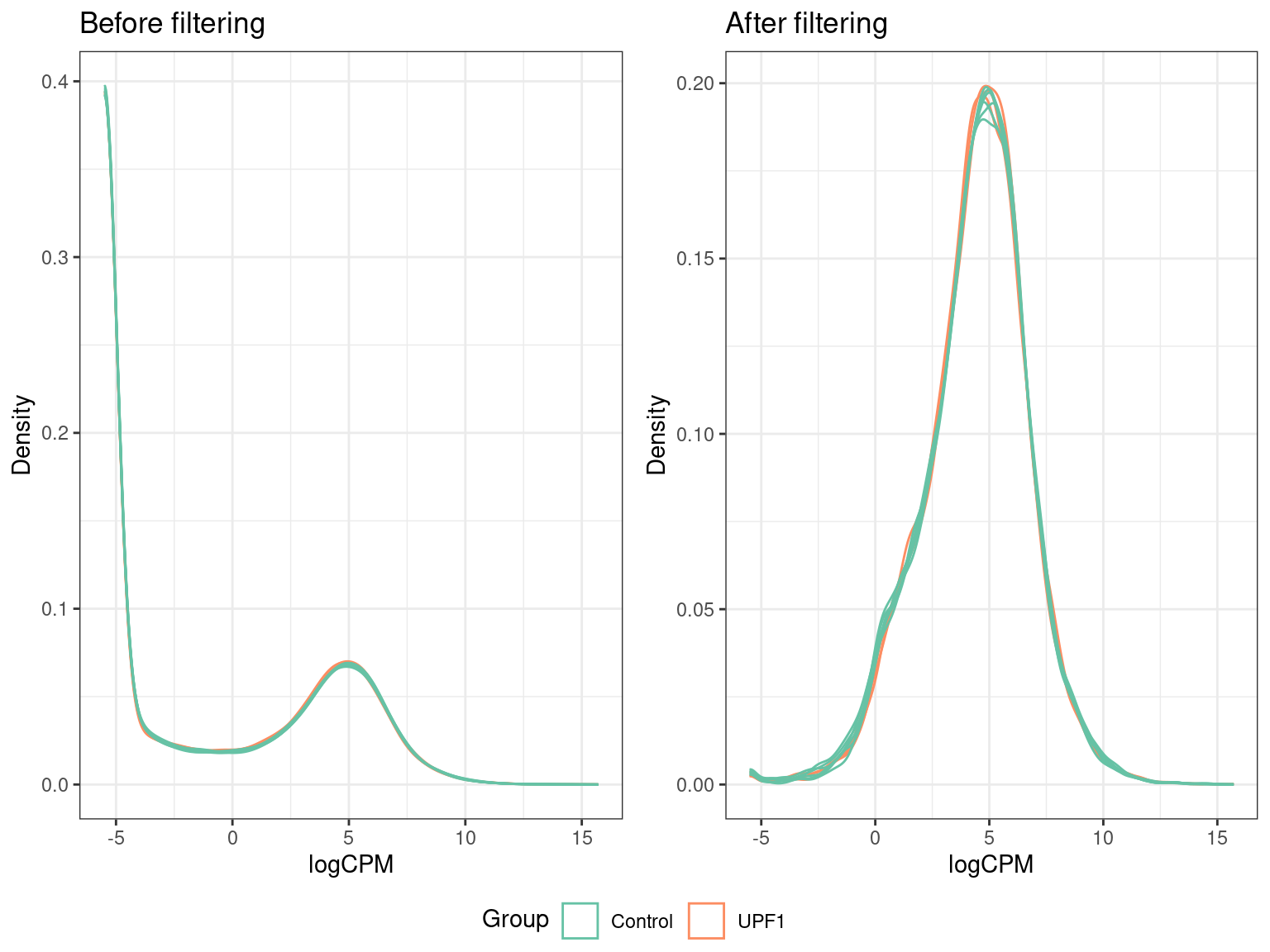
Here we can see that prior to filtering, the majority of genes counted in each sample had very low (or no) counts. The fact that all our samples follow a similar distribution is an indication of good quality data. In particular, we expect samples belonging to the same group to follow a similar distribution.
Principal Component Analysis (PCA) projects high-dimensional data (e.g. gene counts) into a smaller set of orthogonal principal components. This is helpful for quality assessment and the identification of outlier samples. Principal components can be conceptualised as sources of variation within the data. The first principal component (PC1) captures the largest source of variation, while the second component captures the second largest, etc. Therefore, by plotting the principal components, we can infer that clustered samples are more similar than those that separate. Generally, the first thing we look for is separation between the experimental groups on a PCA plot.
To perform a PCA we must first normalise our count data to logCPM values.
Normalisation in edgeR is performed using the trimmed mean of M values (TMM) method. TMM normalisation accounts for both library size and composition, allowing (with assumptions) expression estimates of the same gene to be compared across different samples. Be aware that this does not allow expression estimates of different genes to be compared either within or between samples. TMM normalisation is performed in R with the normLibSizes() function, resulting in normalisation factors that are stored in the samples element of our DGEList object. Normalisation factors are used to calculate effective library sizes, which are then used to calculate CPM. We executed this function above when creating the DGEList.
cpm <- dge_list %>%
cpm(log = TRUE)pca <- cpm %>%
t() %>%
prcomp()
pca_vars <- percent_format(0.1)(summary(pca)$importance["Proportion of Variance",])We can now plot the principal components to determine if there is separation between our samples and/or if there are any outliers.
pca_1v2_group <- pca$x %>%
    as.data.frame() %>%
    rownames_to_column("sample") %>%
    left_join(dge_list$samples) %>%
    as_tibble() %>%
    ggplot(aes(PC1, PC2, colour = group, label = sample)) +
    geom_point(size = 3) +
    geom_text_repel(show.legend = FALSE) +
    guides(fill = "none") +
    labs(
        title = "Principal component analysis",
        x = paste0("PC1 (", pca_vars[["PC1"]], ")"),
        y = paste0("PC2 (", pca_vars[["PC2"]], ")"),
        colour = "Group"
    ) +
    scale_colour_manual(values = pal_group)
pca_1v2_sex <- pca$x %>%
    as.data.frame() %>%
    rownames_to_column("sample") %>%
    left_join(dge_list$samples) %>%
    as_tibble() %>%
    ggplot(aes(PC1, PC2, colour = sex, label = sample)) +
    geom_point(size = 3) +
    geom_text_repel(show.legend = FALSE) +
    guides(fill = "none") +
    labs(
        title = "Principal component analysis",
        x = paste0("PC1 (", pca_vars[["PC1"]], ")"),
        y = paste0("PC2 (", pca_vars[["PC2"]], ")"),
        colour = "Sex"
    ) +
    scale_colour_manual(values = pal_sex)
ggarrange(
    pca_1v2_group, pca_1v2_sex,
    ncol = 1
)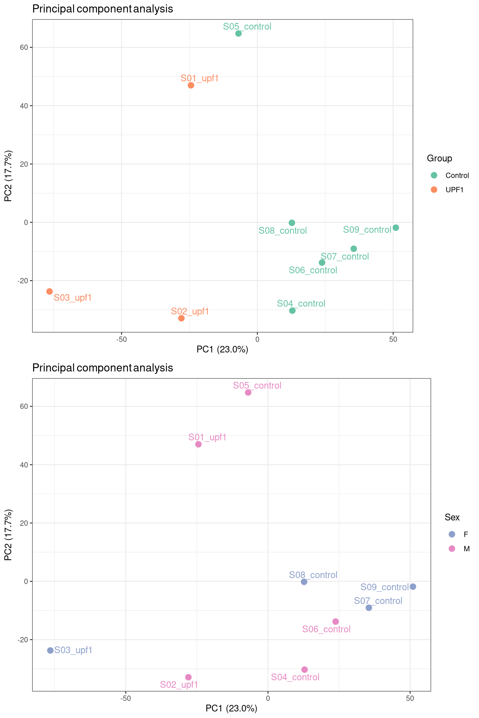
We chose to colour our samples by factors we expect may introduce variability into the data. Encouragingly, the mutant UPF1 samples separate from the control samples across PC1, which has captured ~25% of the variation in the data. There is no clear separation between samples by sex, suggesting that sex-specific differences are not the primary source of variation in this dataset. This kind of exploratory analysis informs us of what covariates to include in our model for differential expression testing.
It is often useful to check other principal components, especially when the data does not behave as nicely as in this example.
pca$x %>%
    as.data.frame() %>%
    rownames_to_column("sample") %>%
    left_join(dge_list$samples) %>%
    as_tibble() %>%
    ggplot(aes(PC1, PC4, colour = sex, label = sample)) +
    geom_point(size = 3) +
    geom_text_repel(show.legend = FALSE) +
    guides(fill = "none") +
    labs(
        title = "Principal component analysis",
        x = paste0("PC1 (", pca_vars[["PC1"]], ")"),
        y = paste0("PC4 (", pca_vars[["PC4"]], ")"),
        colour = "Sex"
    ) +
    scale_colour_manual(values = pal_sex)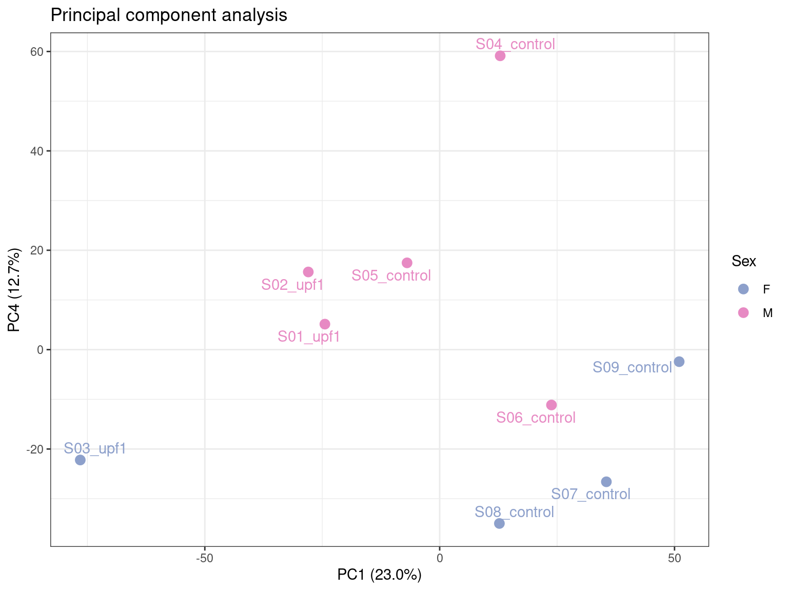
Here we can see that PC4 has potentially captured the sex-specific differences, accounting for ~14% of the variation.
PCA is just one type of dimensionality reduction technique. Multidimensional scaling (MDS) is also commonly employed for the same purpose.
The design matrix is a critical component of statistical modelling approaches to determine differential expression. It defines the experimental design and specifies how the variables in a study relate to the observed gene expression data. I find this paper an incredibly useful resource to guide the construction of both simple and complex design matrices.
design <- model.matrix(~0 + group, data = dge_list$samples) %>%
    set_colnames(str_remove(colnames(.), "group"))
Here we have parameterised the design matrix as a means model for DE testing. A means model lacks an intercept term, meaning we have to specify contrasts to calculate the difference between mutant and control samples. While this requires an extra step, I personally find this setup more intuitive and flexible. One may also use a mean-reference model to achieve the same eventual outcome, whereby the control group is generally specified as the intercept representing baseline expression and therefore allowing direct calculation of the difference between mutant and control. Refer to the above paper to understand the difference in parameterisation and how either choice can achieve the same end result.
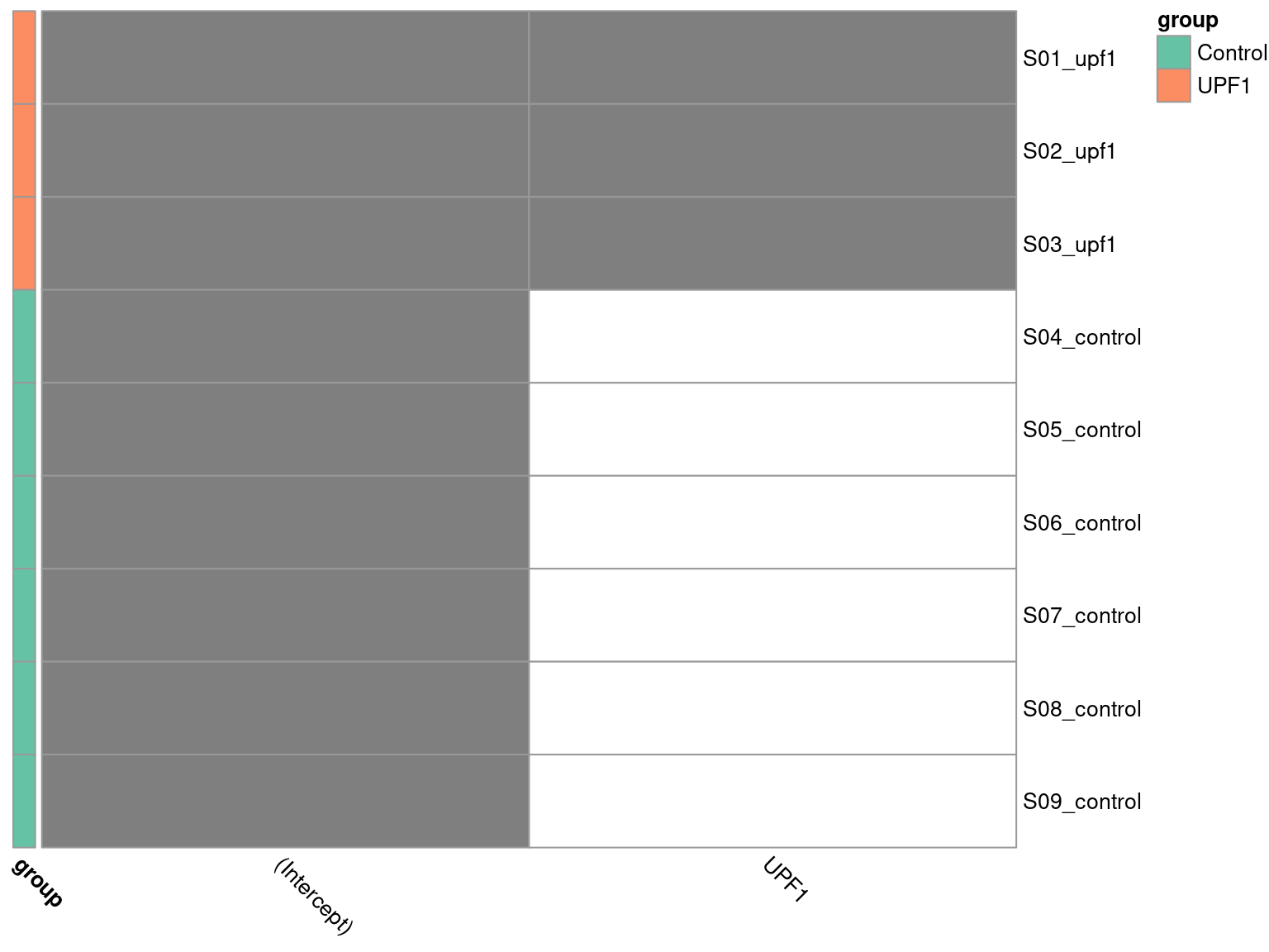
To visualise the design matrix, we can plot a binary heatmap.
pheatmap(
    design[meta$sample,],
    cluster_cols = FALSE,
    cluster_rows = FALSE,
    color = c("white", "grey50"),
    annotation_row = dge_list$samples["group"],
    annotation_colors = list(group = pal_group),
    angle_col = "315",
    legend = FALSE
)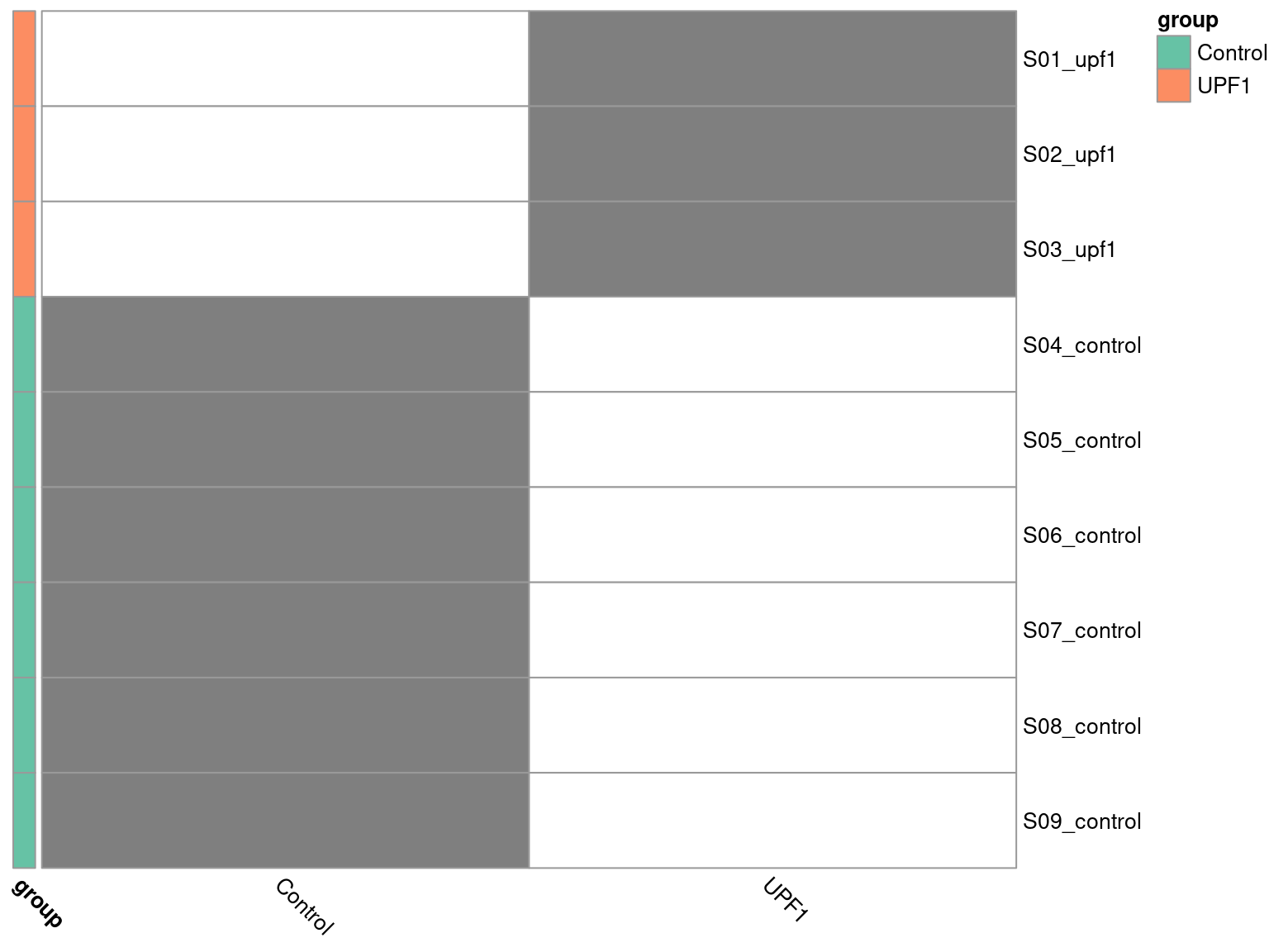
Here we have to ensure R knows the group column of our dge_list$samples object is a categorical variable, by setting it as a factor object. Additionally, the control group is required to be first level of the factor, such that it forms the intercept. We specified this explicitly when initially loading the metadata.
design_2 <- model.matrix(~group, data = dge_list$samples) %>%
set_colnames(str_remove(colnames(.), "group"))pheatmap(
design_2[meta$sample,],
cluster_cols = FALSE,
cluster_rows = FALSE,
color = c("white", "grey50"),
annotation_row = dge_list$samples["group"],
annotation_colors = list(group = pal_group),
angle_col = "315",
legend = FALSE
)
Next we construct our desired contrasts.
contrasts <- makeContrasts(
    upf1_vs_control = UPF1 - Control,
    levels = colnames(design)
)
pander(contrasts)| upf1_vs_control | |
|---|---|
| Control | -1 |
| UPF1 | 1 |
We specify the contrast matrix such that the control group expression is subtracted from the mutant group expression. This means our results will be reported from the perspective of our group of interest, i.e. the mutant samples.
Here’s where the smart stuff happens. I’ll attempt to provide a simplified summary of the methodology. For a proper explanation, see the references in section 1.2 of the edgeR User’s Guide.
The first step is to estimate the dispersion (variability) in the data with the estimateDisp() function. This estimates three types of dispersion:
The second step is to fit a quasi-likelihood (QL) negative binomial generalized log-linear model (GLM) to the read counts for each gene with the glmQLFit() function. It also computes a QL dispersion, which reflects the biological variability in counts and the uncertainty in the dispersion estimate, making it more robust to outliers or small sample sizes compared to basic GLMs. It uses empirical Bayes methods to “squeeze” the estimates for genes with unreliable dispersion estimates (e.g. due to low counts) towards the overall trend, resulting in more stable estimates. This provides better control of the false discovery rate (FDR) in RNA-seq data.
The third step performs hypothesis testing to determine whether the expression of a gene is significantly different between the experimental groups with the glmQLFTest() function. This uses the QL F-test to produce a test statistic from which a p-value can be computed.
disp <- estimateDisp(dge_list, design)
fit <- glmQLFit(disp)
tt <- glmQLFTest(fit, contrast = contrasts[,"upf1_vs_control"]) %>%
    topTags(n = Inf) %>%
    .[["table"]] %>%
    as_tibble() %>%
    arrange(PValue) %>%
    dplyr::select(
        gene_id, gene_name, logFC, logCPM, PValue, FDR, everything()
    ) %>%
    mutate(
        DE = ifelse(FDR < 0.05, TRUE, FALSE),
        direction = case_when(
            logFC <= 0 & DE ~ "Downregulated",
            logFC >= 0 & DE ~ "Upregulated",
            !DE ~ "Non-siginificant"
        )
    )
We now have gene-level assigned p-values, as well as other relevant stats in our tt object. Before we take a look at the results, let’s check some plots to ensure everything looks as expected for RNA-seq data.
A mean-variance plot can be used to explore the relationship between the mean expression levels of genes and their variance. This helps to assess the assumptions of edgeR’s methodology, which models gene expression using the negative binomial distribution. Here we are looking to evaluate the model fit. If our data points follow the negative binomial line closely, this indicates that the model has effectively captured the mean-variance relationship.
plotMeanVar(
    disp, show.raw.vars = TRUE, show.tagwise.vars = TRUE, NBline = TRUE
)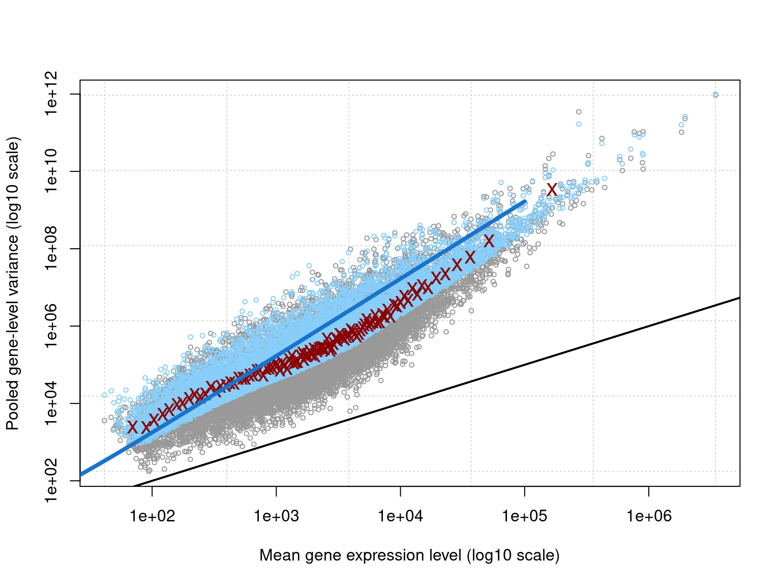
The plot clearly illustrates the overdispersion inherent to RNA-seq data. Overall, the data closely follows the fitted negative binomial line, meaning we have established an appropriate model.
The dispersion estimates can be viewed in a BCV plot. This allows us to assess data quality by identifying expected (or unexpected) patterns in variability. It also helps to validate the model, confirming the estimated dispersion trends align with the expected relationship between expression and variability.
plotBCV(disp)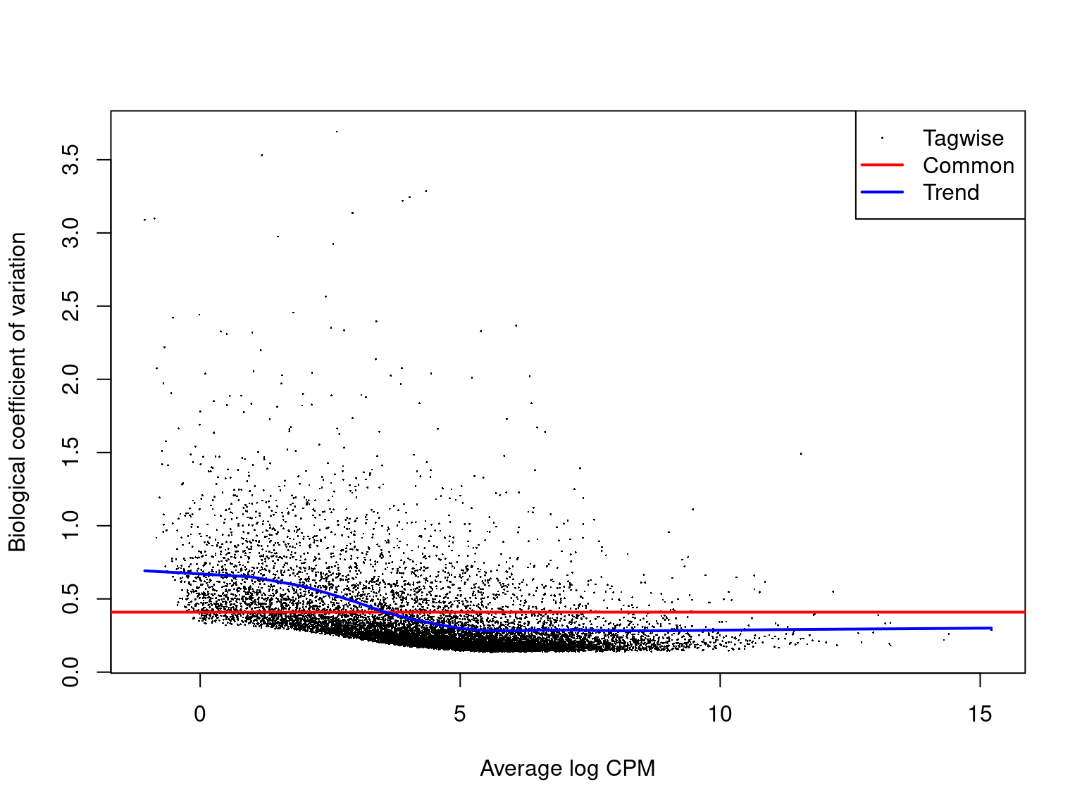
A typical BCV plot shows that variation is higher at low mean expression levels. This is because genes with low counts are more influenced by sampling noise. For very highly expressed genes, the BCV flattens and stabilises, often reaching a minimum value because biological variability dominates over technical noise. The above plot is a great example of what we expect to see from a BCV plot.
The QL dispersions are also useful to visualise. It complements the BCV plot by focusing on the uncertainty in both the dispersion and mean-variance relationship.
plotQLDisp(fit)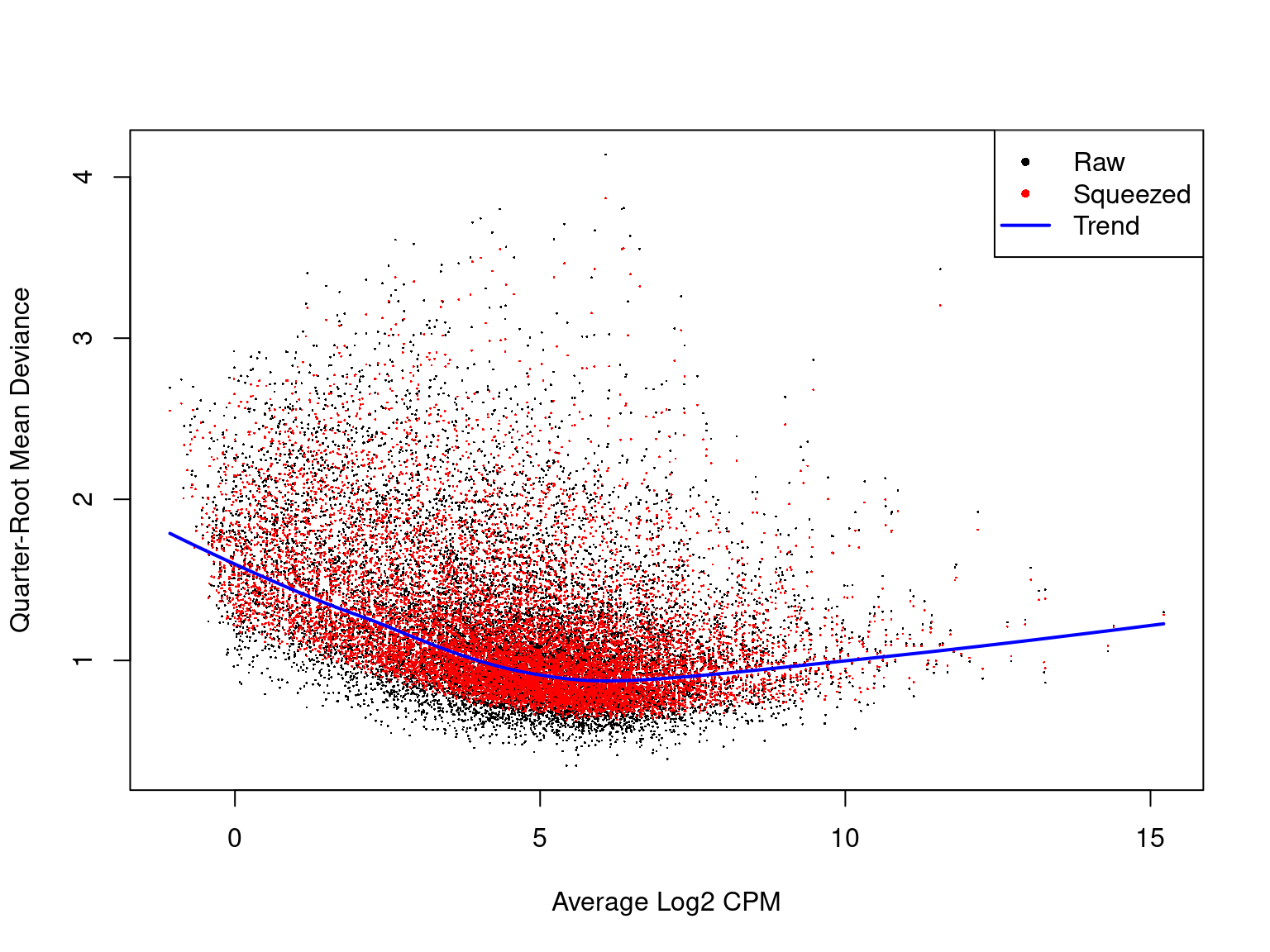
A QL dispersion plot can be interpreted similarly to that of a BCV plot. Additionally, we can see how the dispersion estimates are “squeezed” towards the overall trend in variability.
The reactable package is a great package for producing interactive tables in R. It is highly customisable, which also means it can require a reasonable amount of code. However, your collaborators will appreciate nicely formatted results with the ability to easily navigate through the list of genes. In the following code chunk we define some functions that can be re-used to plot reactable tables with less repetition of code.
lb_reactable <- function(
        tbl, highlight = TRUE, striped = TRUE, compact = TRUE,
        wrap = FALSE, resizable = TRUE, searchable = TRUE,
        style = list(fontFamily = "Calibri, sans-serif"), ...
){
    reactable(
        tbl,
        highlight = highlight, striped = striped, compact = compact,
        wrap = wrap, resizable = TRUE, searchable = TRUE,
        style = style, ...
    )
}
react_numeric <- function(format, digits = 2){
    colDef(cell = function(val, ind, col_name){
        formatC(val, digits = digits, format = format)
    })
}
Our tt object holds the results from our DE analysis ordered by p-value, such that the most significant differentially expressed genes exist at the top of the table. We tested 12,329 genes for differential expression, which is a lot. Rendering the entire set of results in our report will impact its file size, so let’s just take the top 1000.
## browsable() allows us to render this html table interactively in RStudio
browsable(
    ## Use a tagList to include multiple html elements
    tagList(
        tags$caption(glue(
            "The top 1000 most significant genes ",
            "from differential expression analysis. ",
            "{sum(tt$DE)} genes were determined to be differentially ",
            "expressed (FDR < 0.05)."
        )),
        ## Use our previously defined function to create the table
        lb_reactable(
            tt %>%
                dplyr::slice(1:1000) %>%
                dplyr::select(
                    gene_id, gene_name, chromosome = chr,
                    logFC, logCPM, PValue, FDR, DE
                ),
            elementId = "tt",
            defaultColDef = colDef(
                align = "left",
                minWidth = 80
            ),
            ## Numeric column formatting
            columns = list(
                logFC = react_numeric("f"),
                logCPM = react_numeric("f"),
                PValue = react_numeric("e"),
                FDR = react_numeric("e")
            )
        ),
        ## Button to download results as CSV file
        tags$button(
            tagList(fontawesome::fa("download"), "Download as CSV"),
            onclick = "Reactable.downloadDataCSV('tt', 'de_results.csv')"
        )
    )
)It is usual practice in bioinformatics that a logarithm of base 2 is implied where this information is omitted. Therefore, the logFC and logCPM columns indicate the log2 fold change and counts per million respectively. For example, a gene with logFC = 1 indicates a 2-fold increase in expression in mutant samples relative to controls. Similary, a gene with logCPM = 4 indicates an average expression of 16 CPM across all samples.
We classify genes as differentially expressed based on the criteria of a False Discovery Rate (FDR)-adjusted p-value less than 0.05. FDR-adjusted p-values are where raw p-values (PValue column) have been subject to Benjamini-Hochberg correction for multiple hypothesis testing. This is required because we have individually tested the null hypothesis, \(H_0\), that there is no differential expression between mutant and control samples for all 12,329 genes in our dataset.
We only have 6 genes determined to be differentially expressed in this analysis. This may suggest that the sample groups are not very different. However, in this scenario it is more likely that we are lacking statistical power due to having only 3 samples in the mutant group. 3 samples is the minimum number required to capture biological variability, with at least 5 samples being recommended. Unfortunately, when working with patient data these kind of scenarios are often unavoidable, but we can still make use of our results in downstream analyses, such as Gene Set Enrichment Analysis (GSEA).
Volcano plots are used to visualise the relationship between statistical significance and magnitude of change in gene expression. We plot logFC on the x-axis and -log10(p) on the y-axis, such that the most significant genes are observed at the top of the plot. This helps to identify genes that are both highly significant and exhibit large fold changes. We can also assess the symmetry of the plot to determine in there is an approximately equal number of upregulated and downregulated genes. If an unsymmetrical representation is unexpectedly observed, it may indicate an issue with data quality.
tt %>%
    bind_rows() %>%
    arrange(DE) %>%
    ggplot(aes(logFC, -log10(PValue), colour = direction)) +
    geom_point(size = 2, alpha = 0.4) +
    geom_text_repel(
        aes(label = gene_name),
        size = 3,
        data = . %>% dplyr::filter(DE),
        show.legend = FALSE
    ) +
    scale_colour_manual(values = c(
        "Upregulated" = "darkblue", "Downregulated" = "darkred")
    ) +
    labs(y = "-log~10~(*p*)", colour = "Direction") +
    theme(legend.position = "none")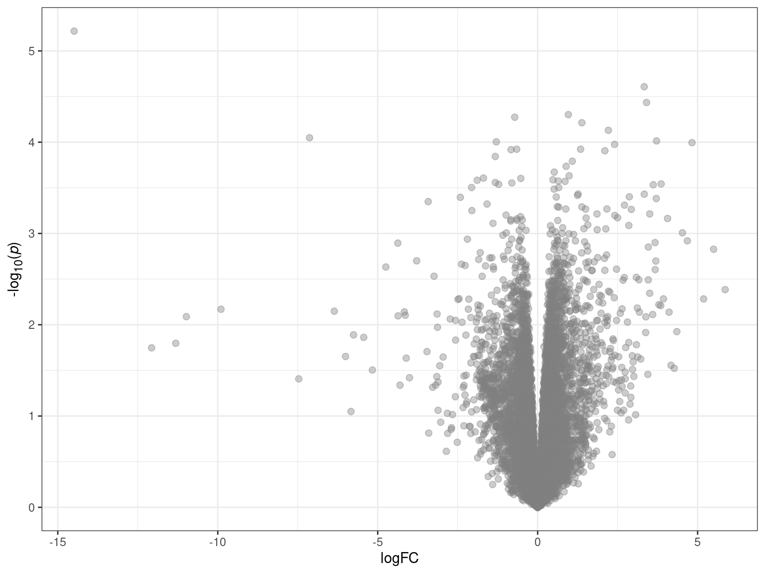
MA plots allow us to visualise the relationship between the magnitude of gene expression change (M) and average expression levels (A). We plot logCPM on the x-axis, and logFC on the y-axis. MA plots are useful for checking whether TMM normalisation has successfully balanced the expression estimates across samples. A properly normalised MA plot should display points mostly centered around y = 0.
tt %>%
    bind_rows() %>%
    arrange(DE) %>%
    ggplot(aes(logCPM, logFC, colour = direction)) +
    geom_point(size = 2, alpha = 0.4) +
    geom_text_repel(
        aes(label = gene_name),
        size = 3,
        data = . %>% dplyr::filter(DE),
        show.legend = FALSE
    ) +
    geom_smooth(se = FALSE, colour = "black") +
    scale_colour_manual(values = c(
        "Upregulated" = "darkblue", "Downregulated" = "darkred")
    ) +
    labs(colour = "Direction") +
    theme(legend.position = "none")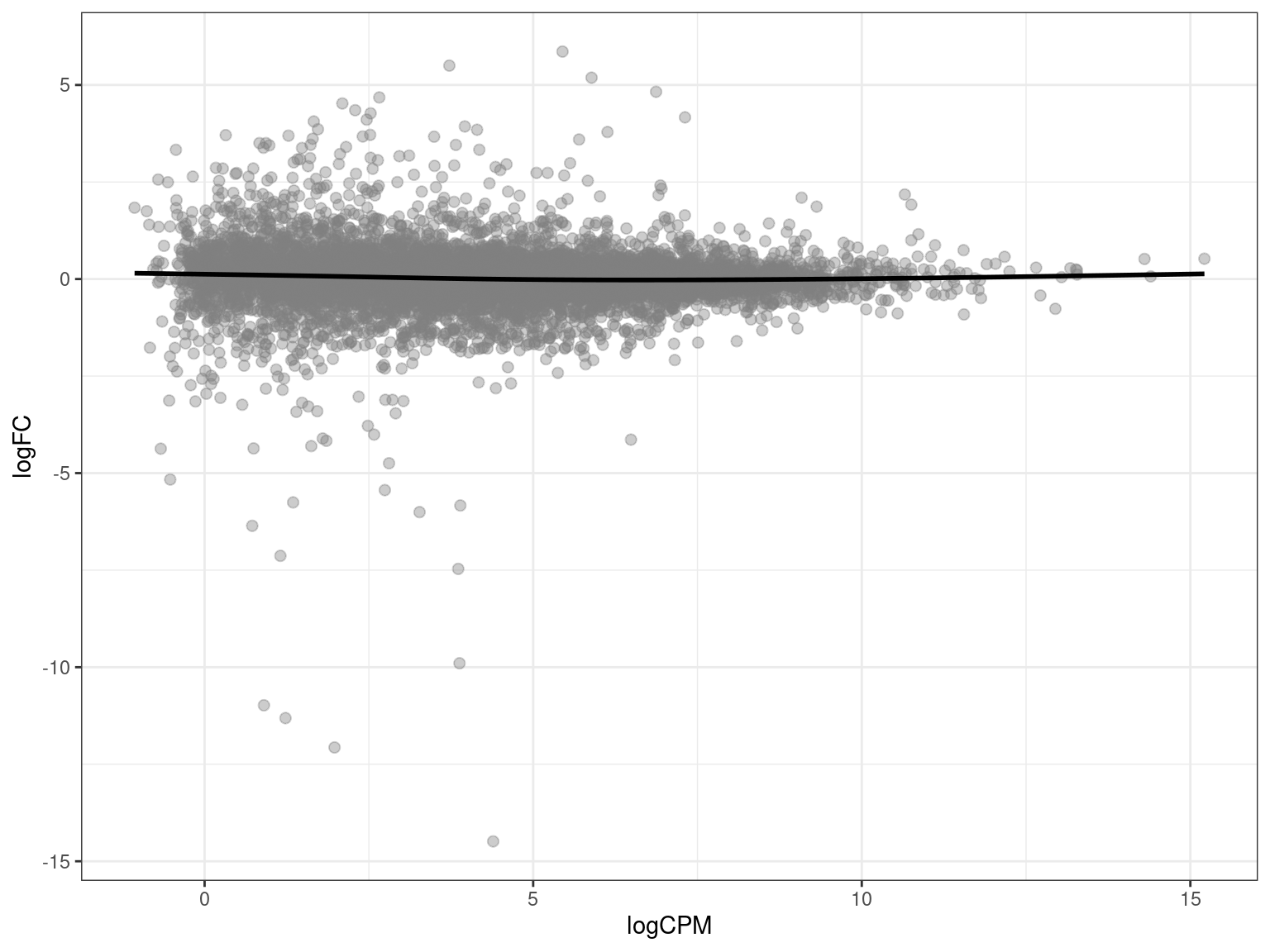
It’s useful to print the session information at the end of your document, listing version information about the operating system, R and its attached packages. This allows reproducibility and has definitely helped me in the past when things have broken after a version update.
sessionInfo() %>%
    pander()
R version 4.5.1 (2025-06-13)
Platform: x86_64-pc-linux-gnu
locale: LC_CTYPE=en_AU.UTF-8, LC_NUMERIC=C, LC_TIME=en_AU.UTF-8, LC_COLLATE=en_AU.UTF-8, LC_MONETARY=en_AU.UTF-8, LC_MESSAGES=en_AU.UTF-8, LC_PAPER=en_AU.UTF-8, LC_NAME=C, LC_ADDRESS=C, LC_TELEPHONE=C, LC_MEASUREMENT=en_AU.UTF-8 and LC_IDENTIFICATION=C
attached base packages: stats4, stats, graphics, grDevices, utils, datasets, methods and base
other attached packages: ensembldb(v.2.32.0), AnnotationFilter(v.1.32.0), GenomicFeatures(v.1.60.0), AnnotationDbi(v.1.70.0), Biobase(v.2.68.0), GenomicRanges(v.1.60.0), GenomeInfoDb(v.1.44.0), IRanges(v.2.42.0), S4Vectors(v.0.46.0), pheatmap(v.1.0.13), tximport(v.1.36.0), edgeR(v.4.6.2), limma(v.3.64.1), htmltools(v.0.5.8.1), reactable(v.0.4.4), pander(v.0.6.6), glue(v.1.8.0), ggtext(v.0.1.2), ggrepel(v.0.9.6), AnnotationHub(v.3.16.0), BiocFileCache(v.2.16.0), dbplyr(v.2.5.0), BiocGenerics(v.0.54.0), generics(v.0.1.4), scales(v.1.4.0), ggpubr(v.0.6.1), RColorBrewer(v.1.1-3), kableExtra(v.1.4.0), here(v.1.0.1), magrittr(v.2.0.3), lubridate(v.1.9.4), forcats(v.1.0.0), stringr(v.1.5.1), dplyr(v.1.1.4), purrr(v.1.0.4), readr(v.2.1.5), tidyr(v.1.3.1), tibble(v.3.3.0), ggplot2(v.3.5.2) and tidyverse(v.2.0.0)
loaded via a namespace (and not attached): rstudioapi(v.0.17.1), jsonlite(v.2.0.0), farver(v.2.1.2), rmarkdown(v.2.29), BiocIO(v.1.18.0), vctrs(v.0.6.5), memoise(v.2.0.1), Rsamtools(v.2.24.0), RCurl(v.1.98-1.17), rstatix(v.0.7.2), S4Arrays(v.1.8.1), curl(v.6.4.0), broom(v.1.0.8), SparseArray(v.1.8.0), Formula(v.1.2-5), fontawesome(v.0.5.3), htmlwidgets(v.1.6.4), cachem(v.1.1.0), commonmark(v.1.9.5), GenomicAlignments(v.1.44.0), mime(v.0.13), lifecycle(v.1.0.4), pkgconfig(v.2.0.3), Matrix(v.1.7-3), R6(v.2.6.1), fastmap(v.1.2.0), GenomeInfoDbData(v.1.2.14), MatrixGenerics(v.1.20.0), digest(v.0.6.37), rprojroot(v.2.0.4), crosstalk(v.1.2.1), textshaping(v.1.0.1), RSQLite(v.2.4.1), reactR(v.0.6.1), labeling(v.0.4.3), filelock(v.1.0.3), timechange(v.0.3.0), mgcv(v.1.9-3), httr(v.1.4.7), abind(v.1.4-8), compiler(v.4.5.1), bit64(v.4.6.0-1), withr(v.3.0.2), backports(v.1.5.0), BiocParallel(v.1.42.1), carData(v.3.0-5), DBI(v.1.2.3), ggsignif(v.0.6.4), rappdirs(v.0.3.3), DelayedArray(v.0.34.1), rjson(v.0.2.23), tools(v.4.5.1), restfulr(v.0.0.16), nlme(v.3.1-168), gridtext(v.0.1.5), grid(v.4.5.1), gtable(v.0.3.6), tzdb(v.0.5.0), hms(v.1.1.3), xml2(v.1.3.8), car(v.3.1-3), XVector(v.0.48.0), markdown(v.2.0), BiocVersion(v.3.21.1), pillar(v.1.10.2), vroom(v.1.6.5), splines(v.4.5.1), lattice(v.0.22-7), rtracklayer(v.1.68.0), bit(v.4.6.0), tidyselect(v.1.2.1), locfit(v.1.5-9.12), Biostrings(v.2.76.0), knitr(v.1.50), gridExtra(v.2.3), litedown(v.0.7), ProtGenerics(v.1.40.0), SummarizedExperiment(v.1.38.1), svglite(v.2.2.1), xfun(v.0.52), statmod(v.1.5.0), matrixStats(v.1.5.0), stringi(v.1.8.7), UCSC.utils(v.1.4.0), lazyeval(v.0.2.2), yaml(v.2.3.10), evaluate(v.1.0.4), codetools(v.0.2-20), BiocManager(v.1.30.26), cli(v.3.6.5), systemfonts(v.1.2.3), dichromat(v.2.0-0.1), Rcpp(v.1.0.14), png(v.0.1-8), XML(v.3.99-0.18), parallel(v.4.5.1), blob(v.1.2.4), bitops(v.1.0-9), viridisLite(v.0.4.2), crayon(v.1.5.3), rlang(v.1.1.6), cowplot(v.1.1.3) and KEGGREST(v.1.48.1)